Consistency in colour for most strong brands is critical. Visual memory is usually what you will recall well, so a brand’s colours are often what you will identify a brand with. Therefore, brand owners don’t want variations in their brand colours, they want consistency across all physical printed materials and online content. Studies have even shown that the right colour can increase brand recognition by up to 87%.
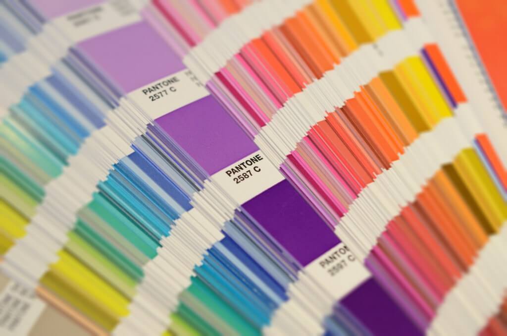
According to Pantone, the revolutionary use of Pantone colours began in 1963 with their purpose being to standardize colour and make it possible for designers, manufacturers and printers to provide their customers with the colour accuracy they demand.
How does Pantone differentiate from the CMYK process?
Accuracy is the main benefit of choosing Pantone over CMYK. Pantone inks can accurately replicate colour by using pre-mixed colours and advanced precision. On the contrary, the CMYK process (standing for Cyan, Magenta, Yellow and Black/Key) is the most commonly used process. It uses four colours that are mixed and make up small dots that are layered on top of each other at different sizes and angles to develop the desired colour.
It has been previously stated that most manufacturers are able to match a large percentage of Pantone colours. Up until a few years ago, this was around 85%. More recently, manufacturers such as Epson have claimed that with extended colour gamut printing technology (adding violet, orange and green to CMYK), this figure can be increased to around 99%. (Dive deeper into these statistics here).

Despite Pantone’s colour matching capabilities however, you still need to consider the following if you choose Pantone inks…
Although using Pantone colours means that a specific colour can be replicated perfectly time and time again, the appearance of the colour once printed can vary depending on different substrates. For example, ink will sit higher on the surface of coated paper than it would on uncoated. When printed on uncoated paper the ink will be absorbed and dry from that process.
Another factor that different substrates determine is how light is reflected. Coated paper tends to reflect light in straighter lines giving a brighter impression of colour, as opposed to uncoated paper that reflects light in random directions which dulls the colours. (You can read more about this here).
Tip: Make sure you choose your print supplier carefully. ‘Upload-and-go’ companies aren’t going to guide you when choosing the right colours, processes and substrates; they’ll just go straight to print. Find a print management company who will be an extension of your team and guide you from the beginning to the end on your important decision making.
Cost and efficiency
When printing in Pantone colours, the machine being used must be specifically set up per job. This is why larger print runs are preferred for this process. CMYK on the other hand tends to be cheaper as you can bundle different jobs together.
Sometimes, to make a print job more cost effective, a client will ask for a job to be printed in the CMYK equivalent of their usual Pantone colours.
“Is that possible?”, you ask?
Well, Pantone swatch books do provide a CMYK match for each Pantone however, it provides the closest match but not necessarily an exact one. Therefore, if consistency of colour is more of a priority than cost, then it’s best to stick to the Pantone ink.

Deciding between Pantone and CMYK
The ‘design stages’ are when you first need to consider the printing process you want to move forward with, as it will determine how you set up your artwork. In order to achieve consistent branding, Pantone is the better option so consider this when designing your logo and branded content. However, in cases where you aren’t concerned about exact colour matches, for example, internal documents, they can be printed in CMYK. (We’ve found a great article to help you with picking the right Pantone colour when designing for print, click here).
Colour influences and representations
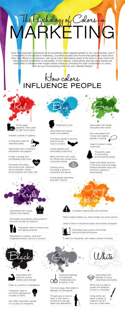
If you’re just starting out and deciding on colours for your branding/rebranding, it is worth reading up on the psychology of colour. This is highly considered by most successful brands, take McDonald’s for instance;
– Red and yellow are said to appeal most to children
– Red creates a sense of urgency (therefore works well with the fast-food concept)
– Yellow promotes optimism (aligning well with the tag line ‘I’m lovin’ it’)
In addition, bear in mind ‘Pantone Colour of the Year’. When Pantone Colour of the Year is decided, it isn’t only colour trends that are considered but what the colour represents and the broader connotations of it. So, this could be of use to you when choosing your branding colours. Remember that trends do change though so don’t pigeon-hole yourself to the trends of one year. It may be that you consider how to incorporate that colour into elements on social media posts for example, rather than basing your entire branding upon it. (You can read more on Pantone Colour of the Year here).
Now you’re a Pantone pro, but if you have any more questions or simply want to let us know your thoughts on our blog post, you can connect with us on Twitter @birchprint.
Psssst, keep an eye out for our video to be posted soon, in relation to this topic!

