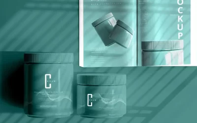
You can’t overstate the importance of good product packaging.
It’s the first thing that many customers see, first thing that grabs attention, and it’s often an influential factor in what decides their purchase.
Surveys into consumer choice on packaging design have shown that more than half of respondents use packaging appearance when deciding whether to buy a product and whether they trust a brand.
Of course, an attractive design means nothing if it’s poorly printed and constructed. That’s what makes product packaging design more complex than it might first seem.
What is product packaging design?
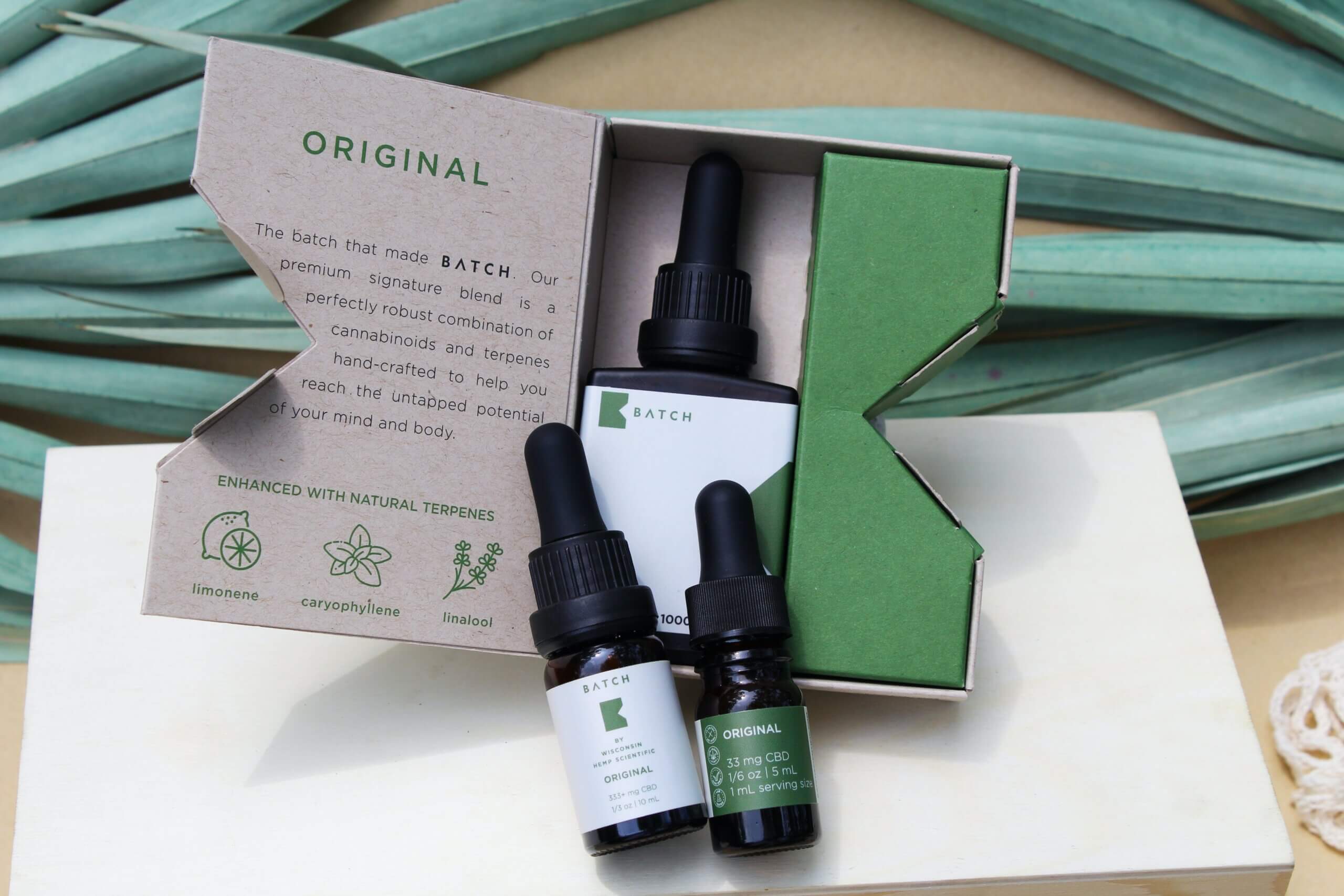
Product packaging design comprises all of the processes and decisions that go into making the container and/or wrapping of a product, whether it’s a can or bottle, tissue paper, or a cover made from thick card stock.
Packaging design itself is quite a broad term, and doesn’t just refer to the visual design printed onto a piece of packaging. It includes the colours and graphics that make up the overall theming, the shape and physical design of the packaging, and what can be seen as the more minor details such as font and the size and layout of text.
Marketing data and analysis combines with creativity to design the ideal packaging, which should catch a viewer’s attention but also accurately reflect the tone and purpose of a product.
What should I consider in product packaging?
Packaging ultimately needs to reflect its product and the brand to which that product is attached.
You can’t design truly effective packaging without this knowledge and understanding, because a disconnect between the visual signatures of a brand and its packaging will confuse a customer at best, and at worst may actively discourage them from buying.
There’s a wealth of factors to bear in mind when designing packaging, but these boil down into two key considerations:
- What the product is and what it’s designed to do
- Who might buy the product and whose attention you need to grab
Of course, there are other important points that can heavily influence how packaging is designed, such as the typical journey of the product.
If your product is sold mostly or entirely through the internet, you’ll likely want to factor some durability into your packaging and be conscious of the physical demands of shipping it.
Additionally, there is the aforementioned need to make product packaging designs congruent with the product itself and the associated branding. Some brands are strongly tied to colour schemes that they’ve been using for decades. This association might be so strong that customers can distinguish the product from those of competitors at a distance.
This level of association and expectation in the customers’ minds is a strong marketing edge, so to exclude it from packaging risks severely hindering the success of the product.
What makes a good packaging design?
A good packaging design is one that draws the attention of the customer and encourages them to buy the product.
Ideally, the packaging design is one that the customer can identify with in some way, and one that sticks in their mind favourably.
On a marketing and sales level, this is the most basic metric of how ‘good’ the packaging is.
However, for a society that has shifted to more environment-conscious buying habits and ethical values in their spending, good packaging also needs to be sensible.
This means designing packaging in a way that isn’t wasteful with resources. Perhaps some clever box architecture does away with the need for metal-and-plastic twist ties, or a clever layout allows everything to fit snugly in a single box rather than several.
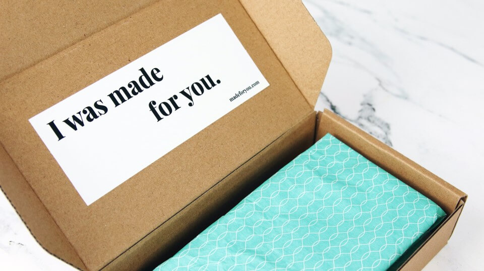
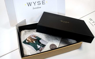
Creating a delightful unboxing experience in which the customer can see how much care and attention has been made, all the way down to the packaging and how the product first enters the customer’s hands, is an important first impression for a brand.
It might be so positive that customers buy the product again to repeat the experience, building brand loyalty and fostering an even more pleasurable association with making a purchase.
Good packaging design combines all of these things with an aesthetic that captures brand identity and speaks to the target audience.
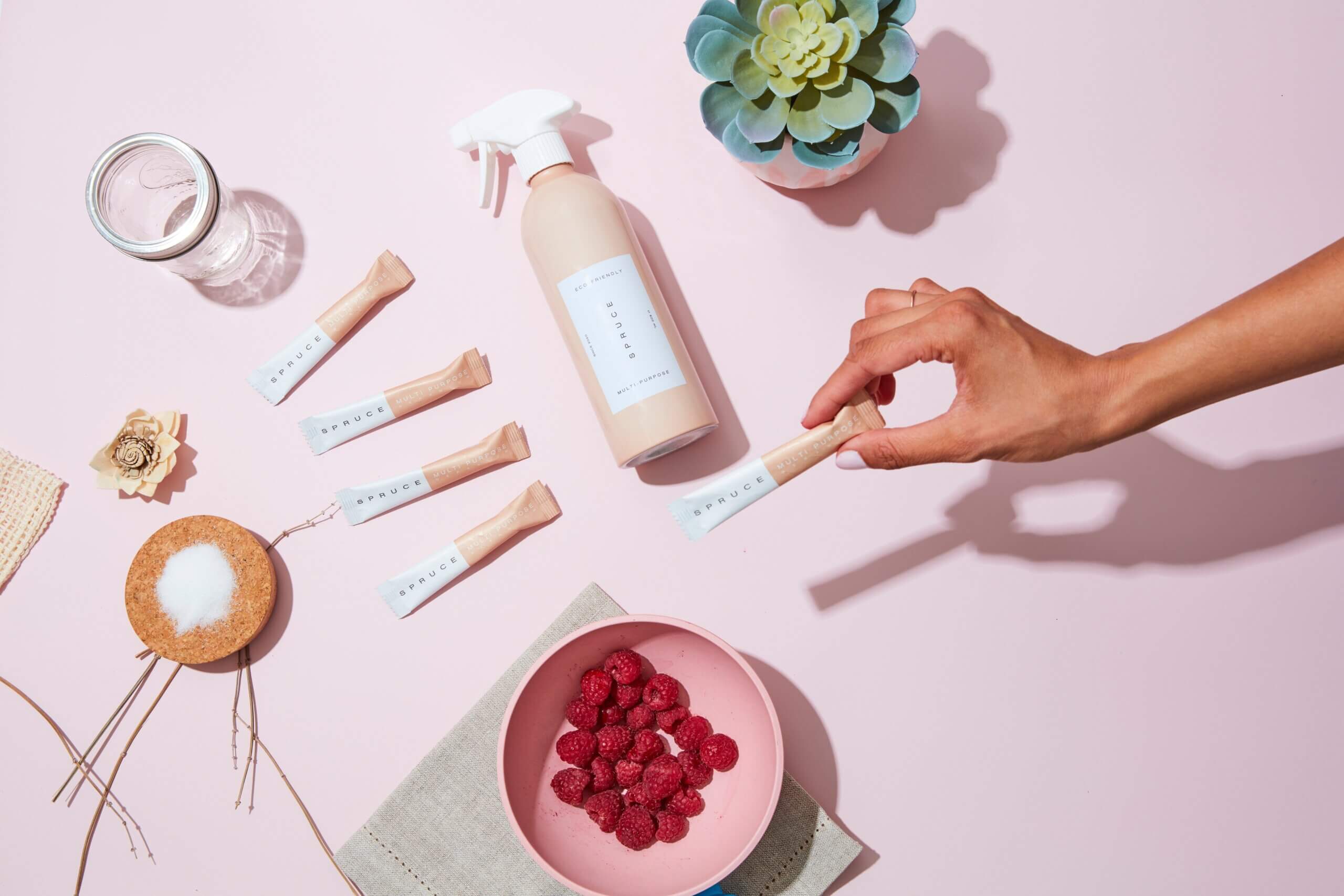
What are the seven basic steps to packaging design?
While there’s no hard and fast structure to designing packaging, there are some essential stages that encompass best practice and ensure your packaging doesn’t fail at the simplest of hurdles.
Look at the market
You can’t create a new entry in the marketplace without knowing what similar products have done with their packaging designs. This is crucial not only for ensuring you don’t accidentally come close to another design—thereby making your product look like a ‘rip-off’ version—but also for keying in on ways that you can do something truly different and stand out from the competition.
Additionally, looking at other products of creative thinking is ideal for inspiration in your own designs.
Research the target audience
To design packaging that creates an impression, you need to understand who it is you’re trying to impress. Alongside researching the market and your existing competition, you need to create the strongest profile or set of profiles for your ideal buyers.
How old they are, where they live, what they do for a living, and how much money they have to spend—these and more are all factors that should go into your understanding of your target audience. Identify their pain points and how the product’s packaging can promise to answer them.
Draft a solid brief
Creating your brief will solidify your plans for the packaging and give you something to return to when unsure. It keeps collaborative work focused and goes some way to ensuring that everybody is working with the same goals in mind.
Understand the product’s main USP
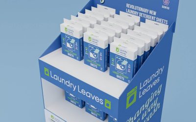
This is more than simply knowing what the product is and what it needs to do. Packaging has limited space to work with, and a viewer’s attention isn’t likely to give every inch of it equal attention. In the case of customers browsing shelves in a physical store, you likely have a momentary window to grab attention.
As such, the packaging needs to emphasise a key piece of information in the limited time it has. That might be the name of the product or one of its features, such as being recyclable or organic. The packaging should, to some degree, be designed around this key unique selling point (USP).
Decide on design elements
Packaging needs to keep a select focus in the elements it uses. Too many clashing colours and differing fonts can be confusing to the eye, looking unappealing and poorly designed.
Choose a specific palette of complementary colours and one or two fonts (such as one for the product name and another for the remaining copy). Images should be chosen with the same kind of restraint, and not used so heavily that they distract away from the point of the product and your brand ethos.
Good design discipline ensures that even minimalistic layouts are interesting and appealing.
Prototype and evaluate
Have your packaging created so that it can be seen ‘in the flesh’. This is much more effective than looking at designs on a screen, and can often illuminate issues that weren’t immediately apparent in the earlier design stages.
Being able to visually inspect your packaging as it appears in a customer’s hands with a pre-production sample, lets you put yourself in their shoes and think about how you would receive that design. How effectively does it achieve your goals, and does it meet the brief that you laid out at the beginning?
Gain feedback from as many relevant sources as possible to gain the clearest picture of what works and what doesn’t.
Refine and perfect
Once you’ve made the necessary edits and finalised the design, it’s time to proof the artwork and ensure your printers have the correct files.
This should also entail checking the copy, ensuring that bleed and crop marks are correct, and making sure the files are using the correct colour model for printing. Essentially, it involves ironing out every last detail that could impact the quality and finish of your packaging (and mean a costly reprint if not caught).
How to improve your product packaging design
Improving your packaging can seem like a tall task, especially if it seems like you got everything right in your last design process.
However, a specialist packaging design and printing provider may be able to appraise your current packaging and give you some key ideas on how improvements can be made. This might be a simple redesign that modernises and streamlines your design, or could be a total overhaul that aligns with a company rebrand.
An improved packaging design can completely change customer perception of your brand and product, often doing a fair share of the work before the product has proven itself.
Why do businesses redesign their product packaging?
Even the most eye-catching design will lose its lustre over time as customers grow used to seeing it often.
Businesses might redesign their packaging for this reason—to bring a fresh new aesthetic to their customers—or they might be redesigning their packaging to align with a rebrand of the entire business.
Some organisations opt to completely change their graphics, colours, logo, and font when rebranding, becoming an entirely new business in all but employees and function, so packaging naturally falls into the pile of things that need changing and realigning when this happens.
Alternatively, a business might redesign its packaging to attract a new audience or push a new development in its products, like a change of ingredients, materials, or product features.
Why is packaging just as important as your product?
To a customer who hasn’t yet bought your product, your packaging essentially is the product.
It’s the only indicators they have of what you’re selling, and if it gives them a poor impression of the brand, then that will be their initial verdict on the product—regardless of whether that’s fair!
Your product might also be competing with several others that occupy the same niche.
In which case, your packaging isn’t so much trying to sell the unique benefits of your product as a concept, but rather stand out and be more attractive than the competition. Your customer could know exactly what it is they’re buying, and are simply looking for the best from the range in front of them.
In scenarios like these, your product is already something the customer wants, and it can’t do much more to prove itself. That task falls to your packaging.
How much does a product packaging design company charge?
That depends on the size of the company and the scale of your work, as well as the complexity of your design.
Packaging design costs are dependent on the circumstances of your brief and whether your packaging designer is also handling other aspects such as printing and delivery.
When looking for product packaging design work, it’s best to compare quotes against what different designers can offer you and their portfolios of existing work.
Packaging design: where to start?
If the complex, meticulous work of packaging design has you confused and feeling daunted, start with Birch.
We’re able to provide full support in your packaging design and printing needs, helping you to create and fully realise the perfect packaging for your product.
We’ve been helping businesses every step of the way in packaging for over 40 years, and we’ve earned their trust thanks to our quality work.
To find out more about our services, contact us today.
